Welcome to the first Compositional ingredient: Colour
Let me start by telling you I didn’t choose colour as the first of ten ingredients randomly. I strategically positioned colour in the #1 spot because it’s really freakin’ important!
Here’s why…
A good photographer, or more to the point, a great photographer, creates an image to connect with a viewer in some way. To communicate with an audience, colour is fundamental in the art of visual connection and communication.
At its core, there are four reasons I believe colour is important and I suggest you consider these carefully:
- Human beings make sense of the world through stories.
- Colour tells a story through psychological and symbolic meaning.
- Colour evokes emotion.
- Colour effects memory.
So, if you want to tell a memorable story that evokes the right emotion with your audience, then you need to know how to use colour in your image composition. I can’t be blunter than that. Now we understand the importance of colour and why it’s our first composition ingredient, let me jump into my six super-tips to using colour successfully in your photography.
Tip one: don’t underestimate the basics
 As you’re reading this ebook, I know you’re passionate about photography, and I imagine you’re already familiar with HSL, but for the sake of our composition crusade, we need to ensure you’re really familiar with it. HSL is how we describe a colour and refers to:
Hue: is the actual colour. I won’t insult your intelligence and spend more time here.
Saturation: is the amount of colour you use, the intensity. A saturated hue in an image composition gives a vivid effect and can make a photo more dynamic. Though excessive use of highly saturated colours in a composition can create confusion as colours may compete for dominance – ultimately creating fatigue or overwhelming the viewer. An image with a less saturated hue appears duller and can have a whitewashed and underexposed effect. The underexposed effect is very trendy right now, particularly in social media photography, so this may be an effect you purposefully create.
Luminance: relates to the brightness of the colour. Technically, luminance measures the intensity of the light that hits the eye as it reflects off an object. Luminance is an objectively measurable attribute. Brightness denotes how the human eye perceives the luminance of the object, making it a subjective attribute.
We could spend weeks diving into luminance and light alone, so I won’t go any further into the theory but highlight the importance of understanding and mastering HSL as a photographer. Particularly in processing. Manipulating HSL gives you the power to transform an image and can help you breathe life into your work. It’s also one of the fundamentals I focus on when teaching processing skills on my tours.
Tip two: take the wheel – the colour wheel that is
Again, I don’t want to tell you how to “suck eggs” here, but I’m always surprised by how many photographers completely underestimate the importance of colour relationships and the colour wheel.
If you don’t trust me, trust Monet. Even Monet took time to study colour theory, relationships, and was influenced by the colour wheel.
I like the Expert Photography Colour Schemes Diagram below as it simply outlines the different colour relationships.
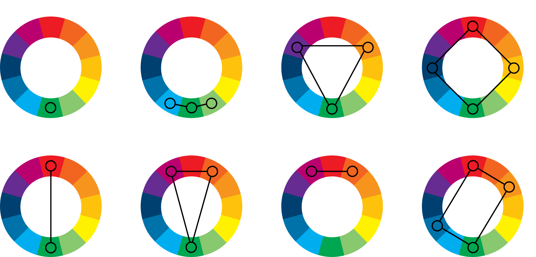
You can also see Expert Photography references eight key schemes, but today I want to focus on only three:
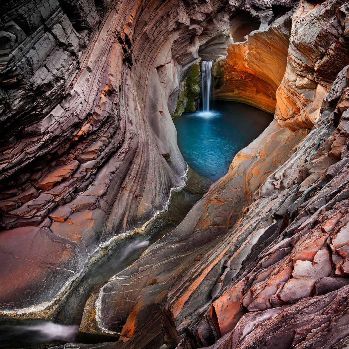
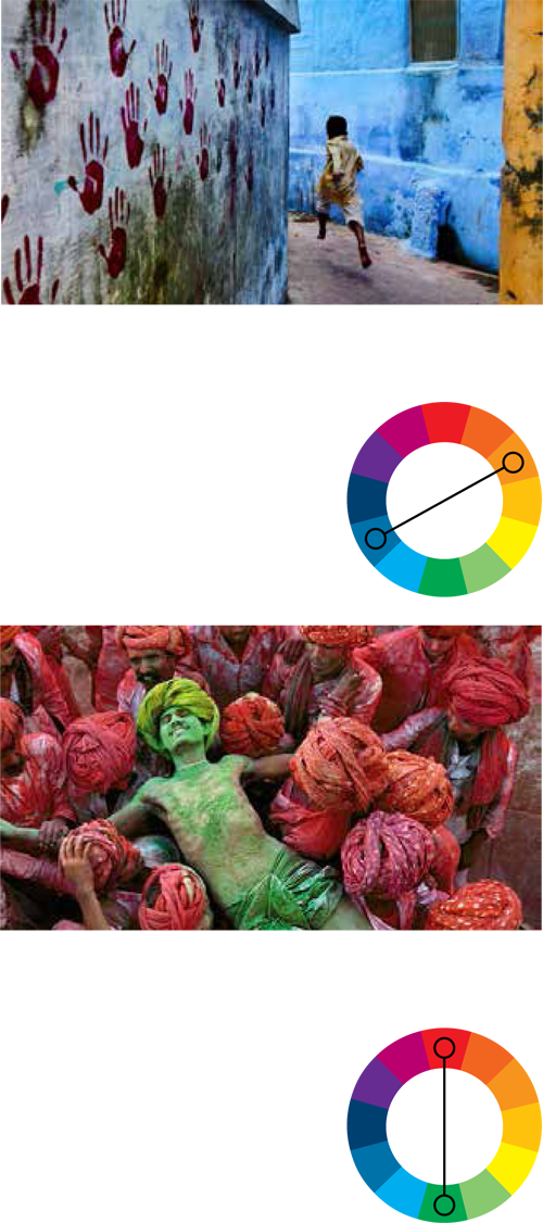
Complementary: This is a case of “opposites attract”. Colours that sit opposite on the wheel are contrasting but complementary. For example, red and green are contrast colours. As are blue and orange. Using complementing but contrasting colours grabs a viewer’s attention, making your image more impactful. I’m going to turn to one of my favourite photographers Steve McCurry to demonstrate this point. You can see in the two iconic images to the right how Steve McCurry uses contrasting colours to pull you in and create impact. Personally, I also love to use contrasting colours in my compositions and if you’re new to it, here are a few tips:
Keep it simple. Contrast works best with images that are simple and not too cluttered:
- Make your image about two or three colours for impact.
- Don’t be afraid to be bold when using contrasting colours.
- Consider using a contrasting colour to highlight your subject.
- You can also use contrasting colours to add accents.
Analogous: These are the colours that sit side by side on the colour wheel, such as red, redorange and orange. Analogous (similar) colour combinations are great if you want to create a sense of calm and harmony in your image. My tip for you is to choose one dominant colour in your image and use the sister colours as accents.
Monochromatic: this is using one hue but different tones and shades of that hue. Black and white photography (which uses varying degrees of grey) is the dominant example of monochromatic photography. Monochromatic provides a strong sense of visual cohesion and is very effective in prioritising a mood or atmosphere. I also use monochromatic colours in my image compositions. I’ve included an example to the right, of a fine art print using monochromatic colour techniques.
Before we move on, we have to take a moment about the variety of colours on the wheel. You’ll notice there are 12 core colours, and these can be defined as primary, secondary or tertiary.
The primary colours, are colours that are not made up of any other colour, other than its own. You’ve probably learnt about the RGB additive colours: red, green and blue. These additive primary colours can be combined in various proportions to obtain any colour in the visible spectrum.
To make things confusing yellow, red and blue are primary colours in the traditional colour wheel and considered the primary colours for pigment. However, for the sake of our crusade, we’ll use RGB as our primaries.
The secondary colours in the colour wheel come to life when you mix two primary colours. Creating orange, green and violet.
The tertiary colours are created by combining a secondary colour with a primary colour creating six colours yellow-orange, red-orange, red-violet, blue-violet, blue-green and yellow-green.
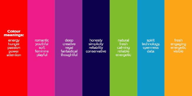
Tip three: get obsessed with colour psychology and symbolism
This is vital if you want to use colour effectively in your photography. I’m not here to dive into the science of colour psychology and symbolism, however, I will tell you that colour has a mental and emotional effect on people. While colour meanings can be subjective to the individual, culture and society influences how people see and interpret colour. As such, colours hold meaning, and colours evoke emotion tied to the meaning associated with it.
To put it another way: colours are bonded with meaning, feelings, and emotion for people.
There are a lot of resources available to you that will help you understand what individual colours mean in our culture, such as the image below. I recommend you take time to check out these resources and consider how you can use colour to evoke feeling and emotion in your photography.
Ignorance is a choice here. Don’t be ignorant.
Tip four: this tip is tied directly to tip three.
Before you take and process an image, you must be very clear about the mood you want to create in your image and the emotions you wish to evoke. If you start with the end in mind, your visual story will be more precise and powerful.
As an example, I use colour purposefully to evoke a feeling of love, to forge positive connections between the image subject and my audience. I’m a travel and landscape photographer at heart, and I consider it my purpose and pleasure to show people just how incredible our planet is. I want my audience to love the places I visit as much as I do and ultimately, I want them to cherish and feel protective of our world.
Alternatively, I work closely with amazing photographers who use their images to draw attention to social issues like anxiety, using colour (or the lack of it) to make the audience uncomfortable, to make them question the way they see the world and to immerse the viewer in the complex and haunting emotions tied to anxiety.
Your emotional intent and the colours you use to set the mood will transform your image.
Tip five: control the visual journey with dominant and receding colours
You can also use colours to create visual depth in your image, and you do this through temperature. Confused? Let me explain…
We know light has a colour. As humans, the colours we see and experience through natural light have created an association between colour and temperature. That’s why we have warm colours and cool colours.
Warm colours include red, orange and yellow. Warm colours have a red bias. Just think of candlelight, a roaring fire, sunrise and sunset. Cool colours are green, blue and violet. Cool colours have a blue bias. Imagine ice-skating and a mountain stream.
As a rule, warm colours/hues tend to appear in the foreground of an image while cooler colours recede into the background. A viewer is attracted warm colours first. You can use the placement of warmer and cooler hues to direct the viewer’s eye in a composition.